
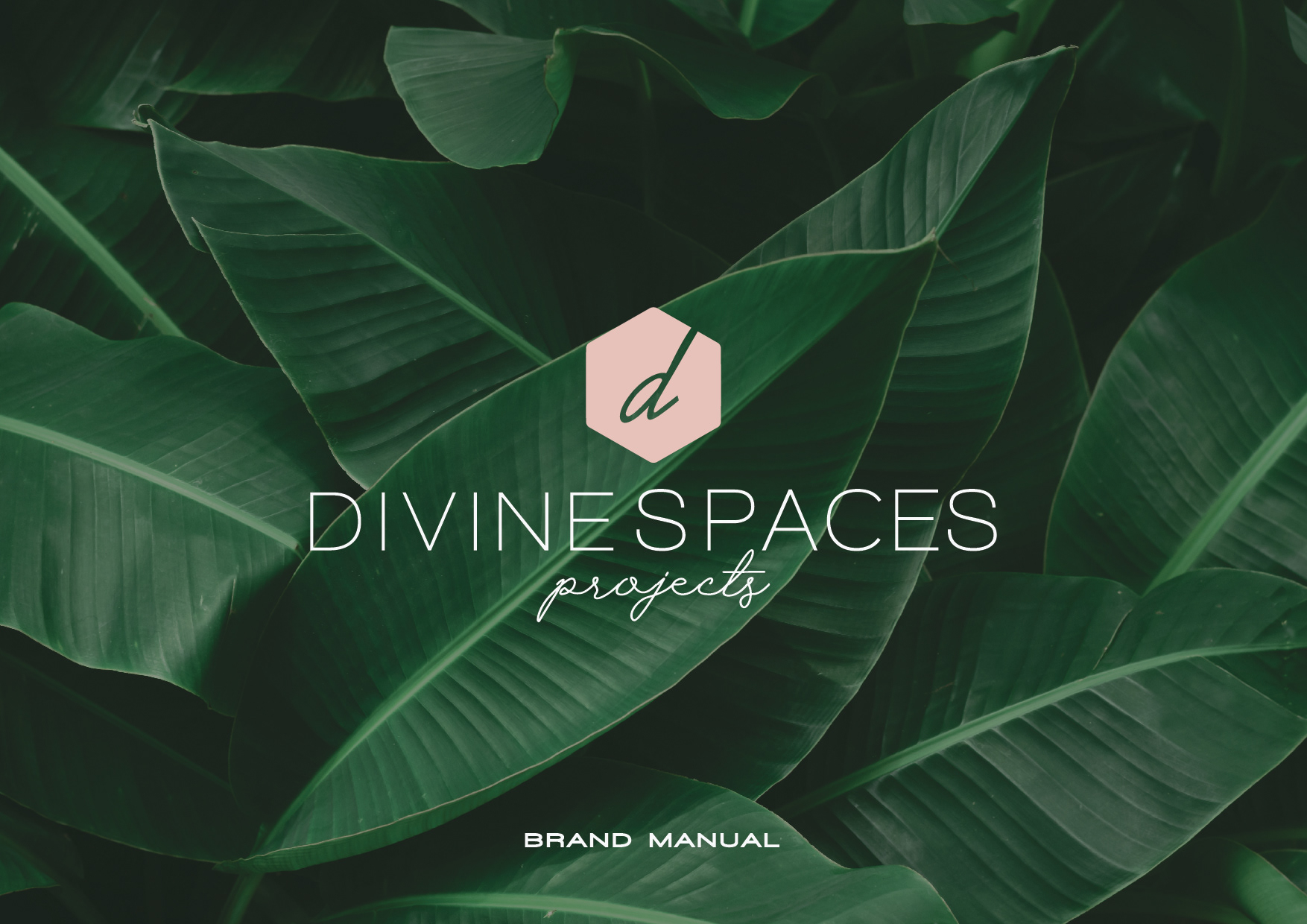

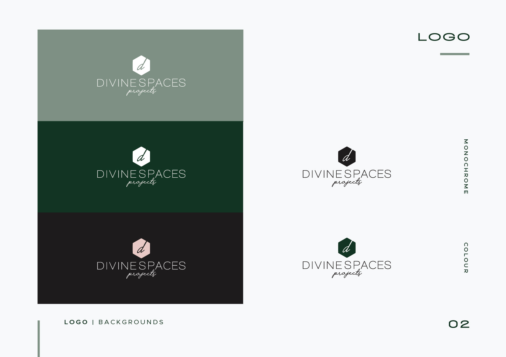
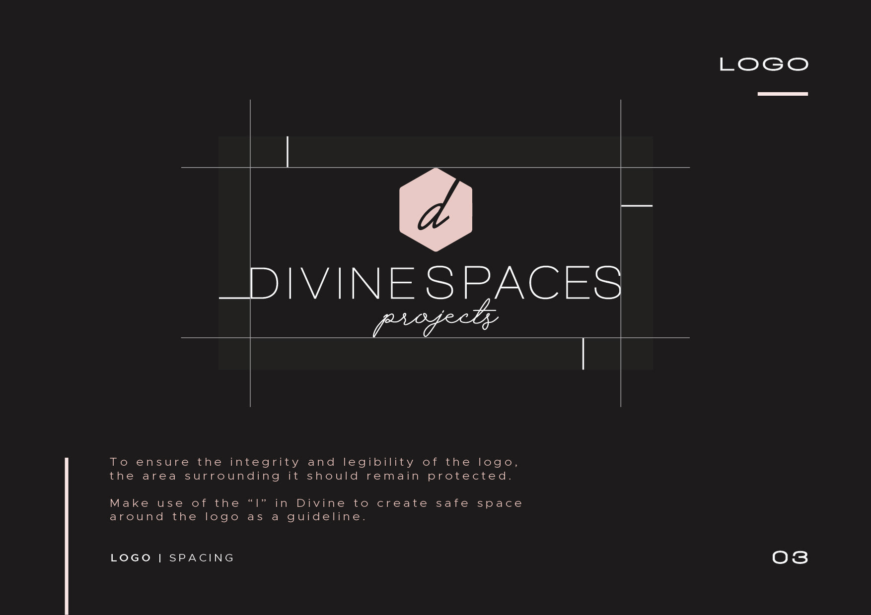
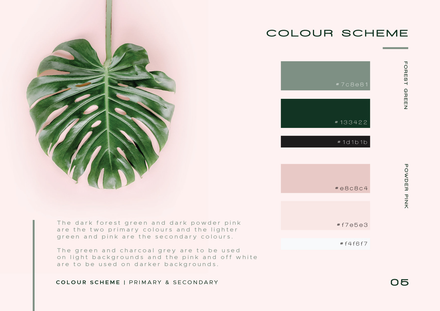
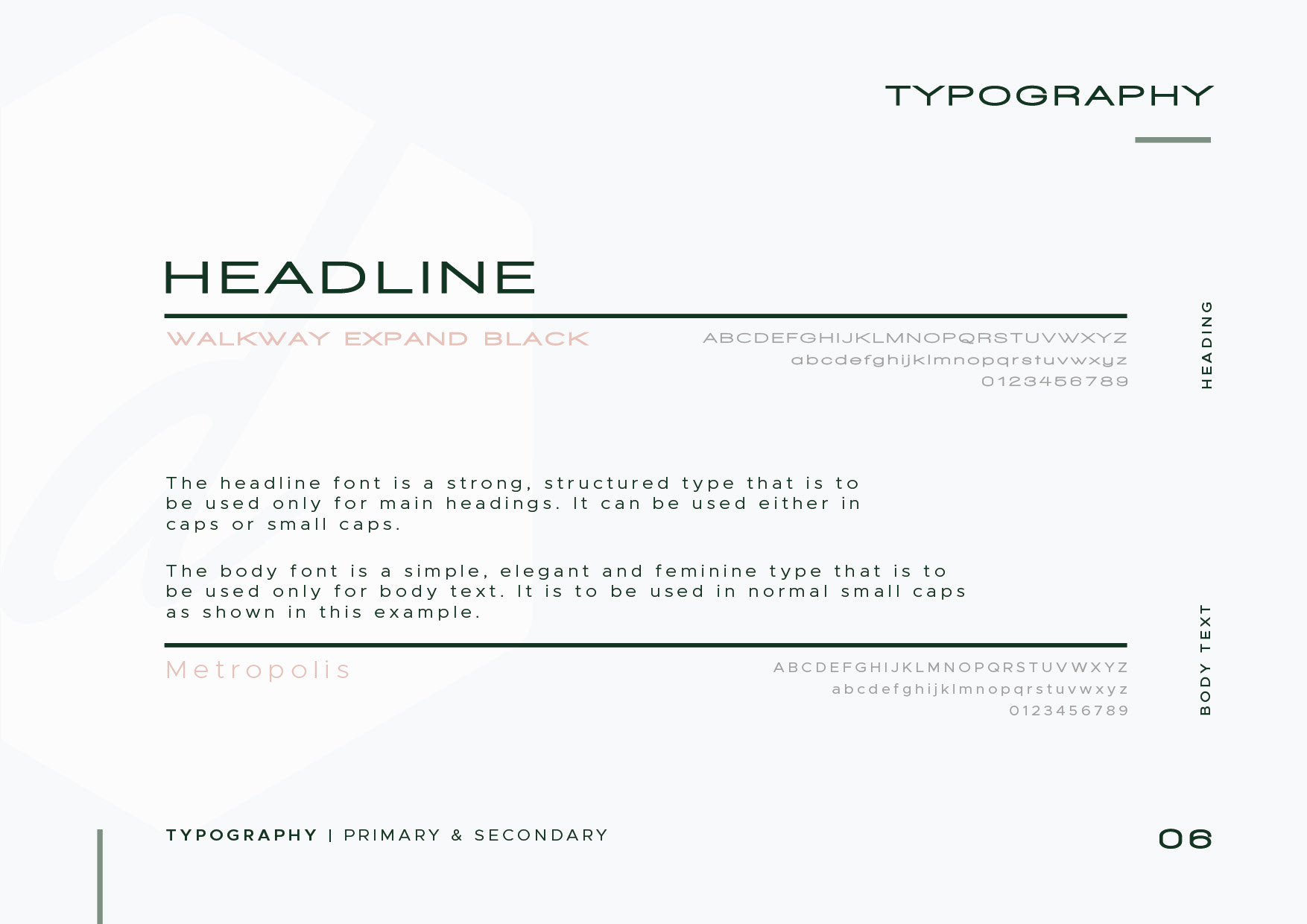
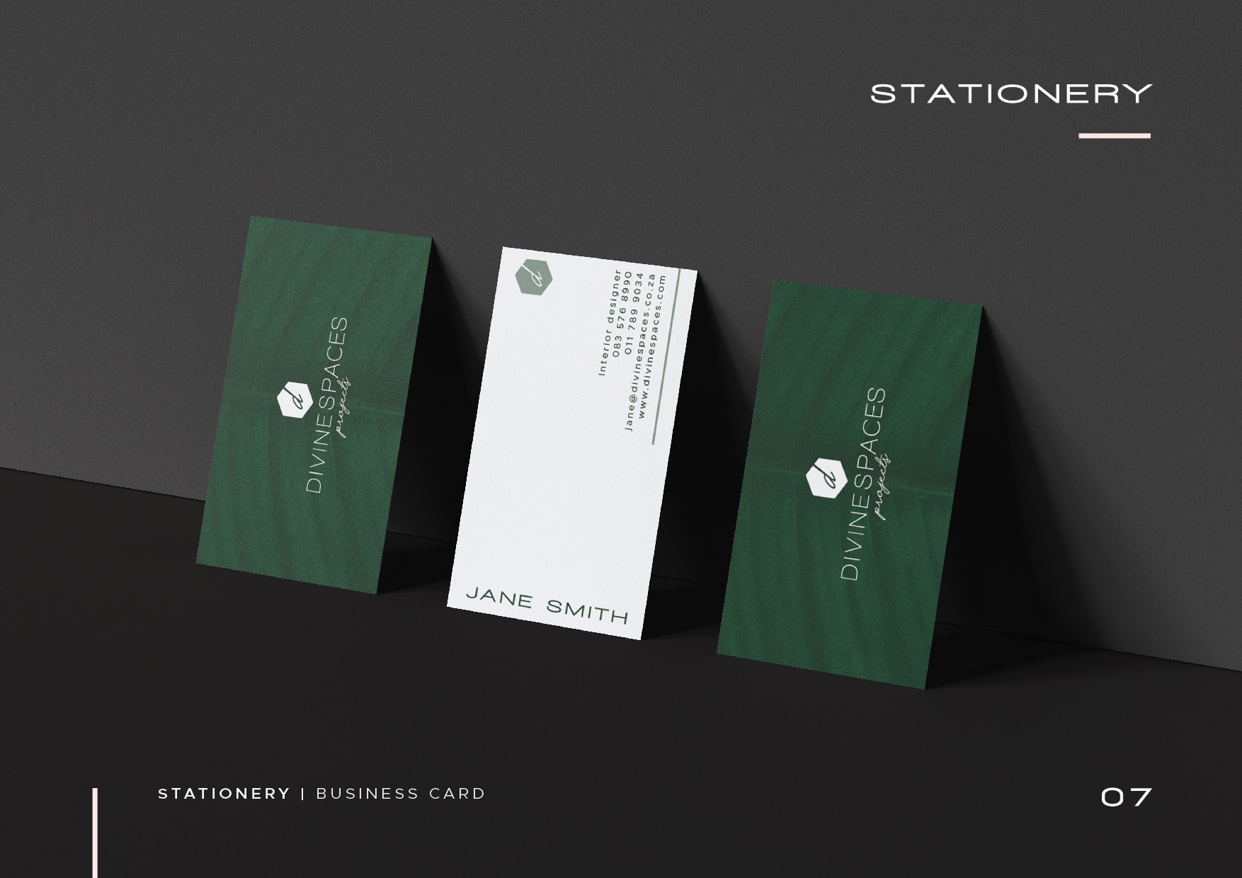
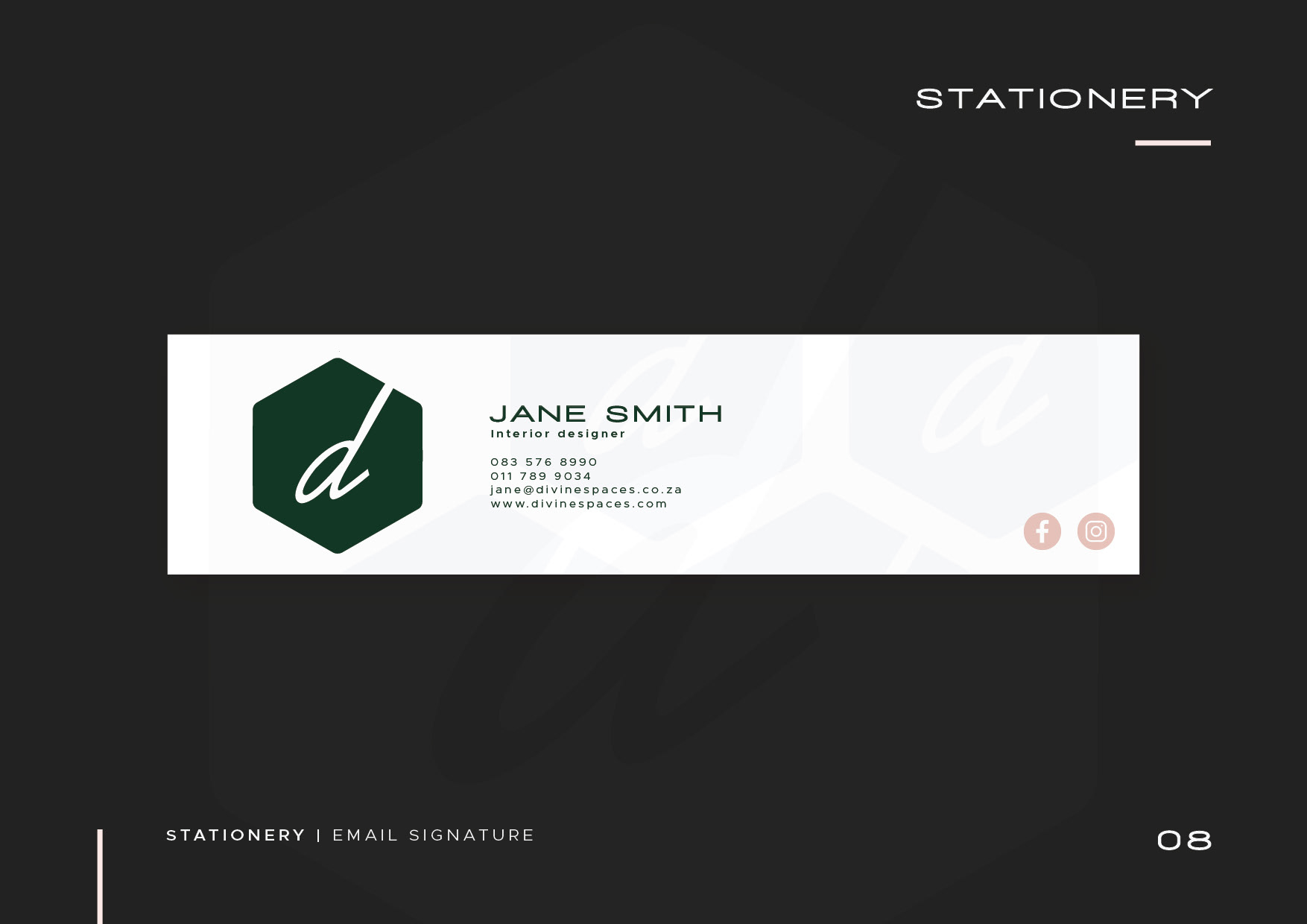
I completed this brand identity manual for an interior design company based in Johannesburg, South Africa, while working for The Brand Cartel. The client gave us their original logo and I had to create a new logo from that while making it look more feminine. I had to use the colour green but then add more feminine colours to the CI to compliment the green. I also made use of a fine san serif font paired with an organic script font for the main logo to give it a more delicate, refined look.