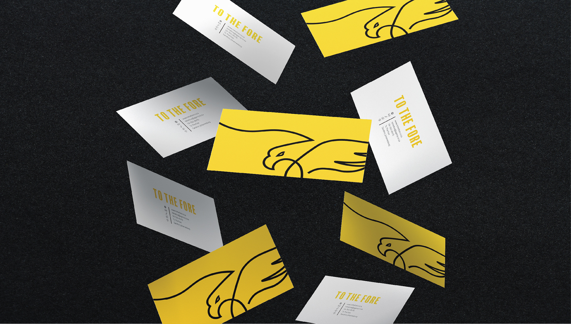
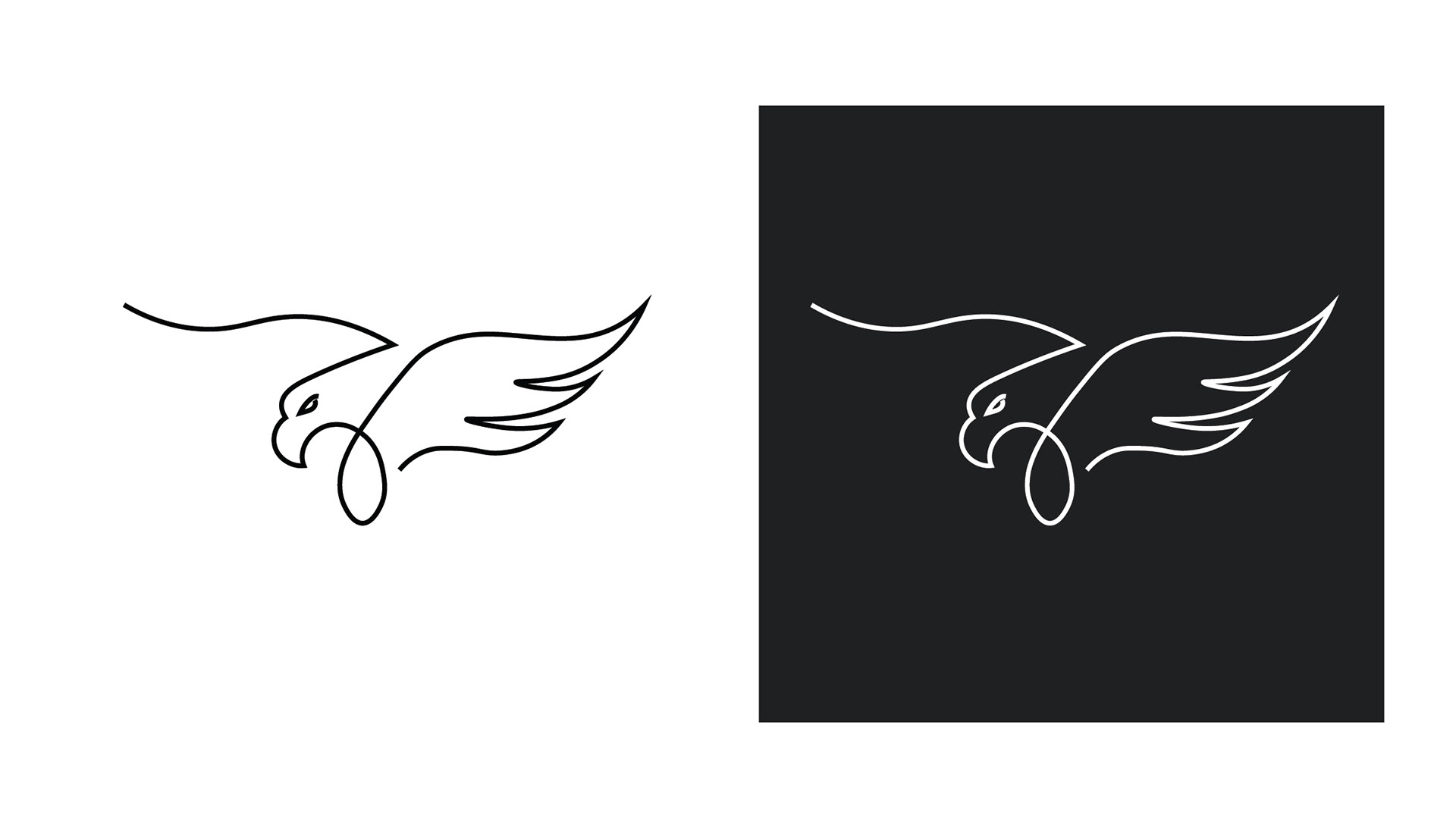
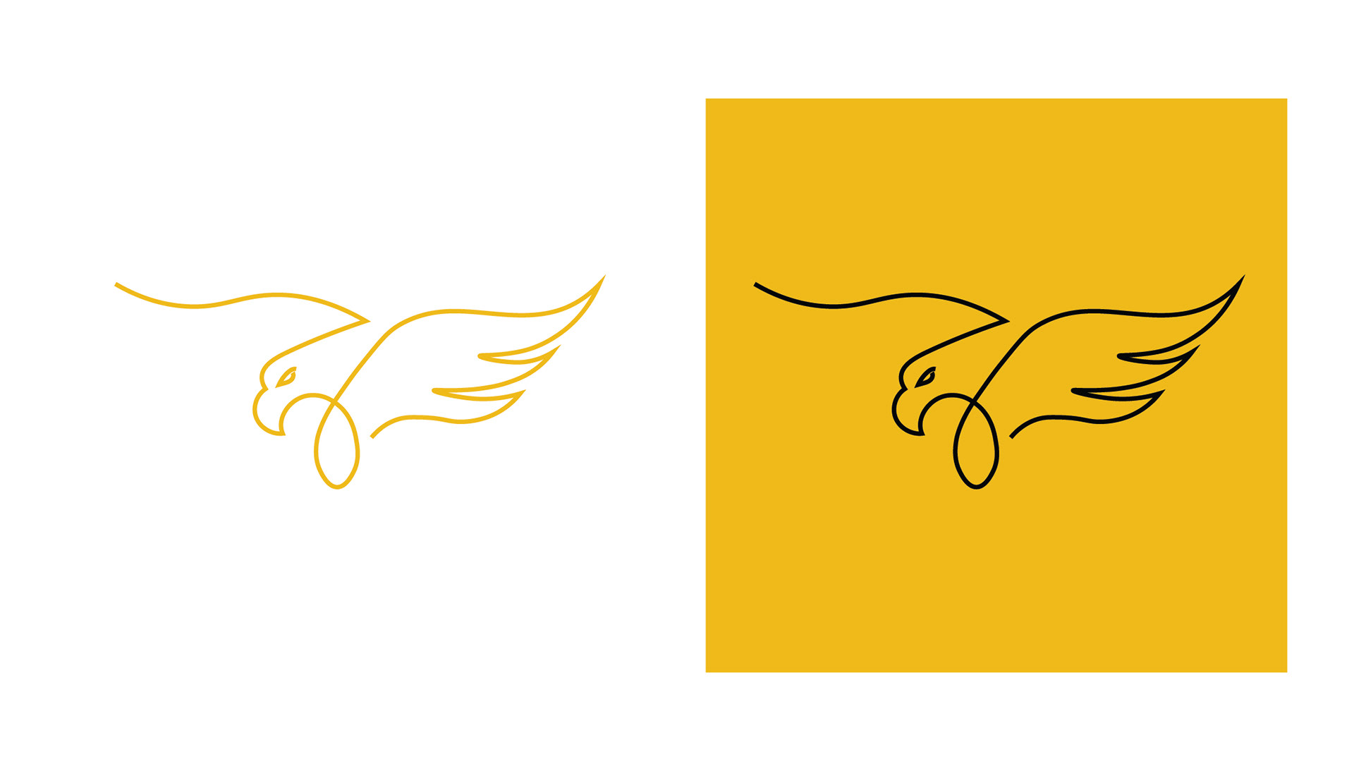

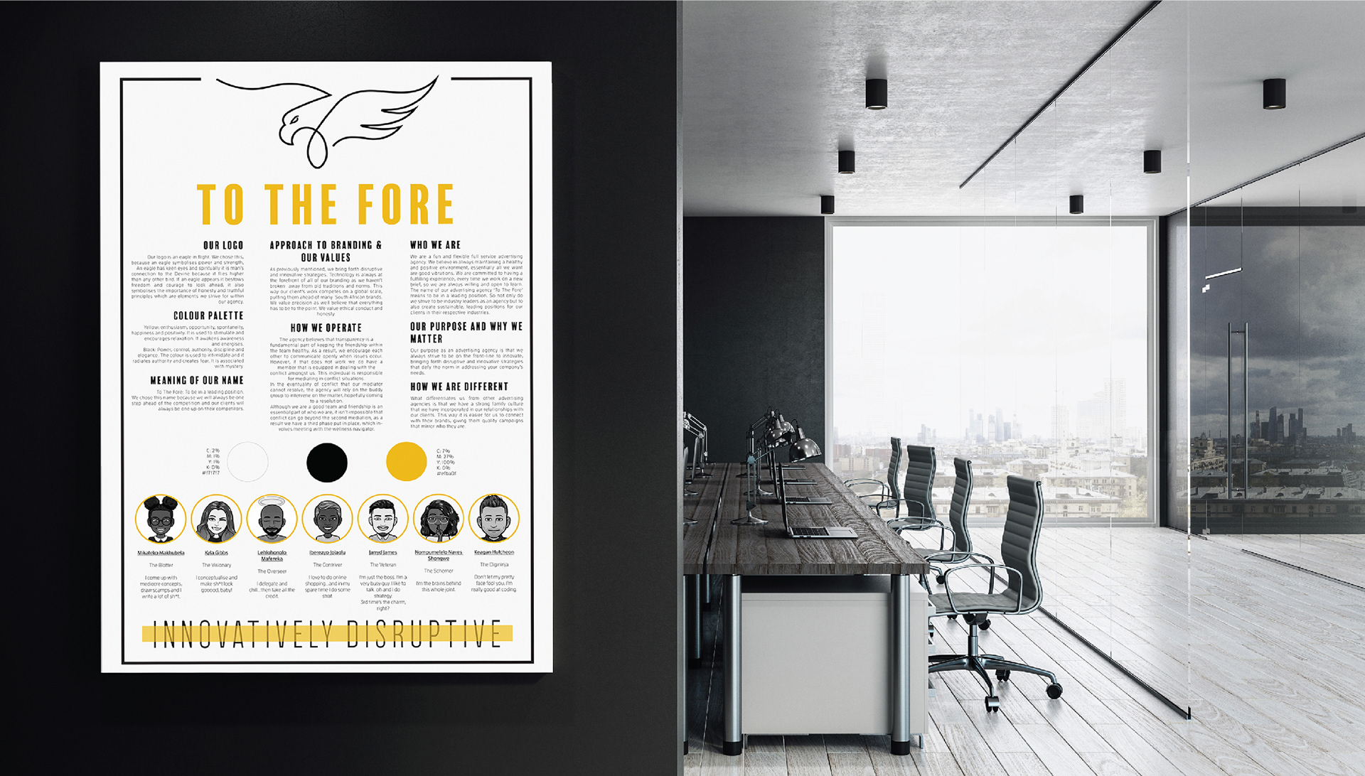
While studying, I created this agency identity for a group project that I was a part of. We gave ourselves the name 'To The Fore’, meaning to be one step ahead or in a leading position. I then decided to create a logo using the symbol of an eagle, as it is the highest flying bird, and it is said that if an eagle appears, it bestows freedom and courage to look ahead. It also symbolises the importance of honesty and truthful principles, which were qualities we wanted to show.